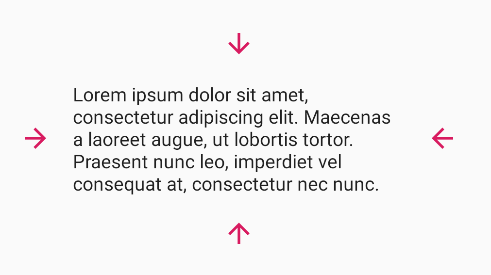
Change gravity of Image Drawable in TextView 🌌
- Optimized way to use drawables with TextView
- Change gravity of compound drawables
- Drawable transformations (resize, tint)
- CompoundViewClickListener
- Right-to-left Support
Download the latest release or grab via Gradle:
allprojects {
    repositories {
        ...
        maven { url 'https://jitpack.io' }
    }
}
dependencies {
        implementation 'com.github.lndmflngs:compound-text-view:1.3.2'
}
The simplest way is to use CompoundTextView like a normal TextView
<com.lockwood.compound.CompoundTextView
    android:layout_width="match_parent"
    android:layout_height="wrap_content"
    android:paddingStart="16dp"
    android:paddingEnd="16dp"
    app:drawableGravity="center"
    app:drawablePadding="16dp"
    app:drawableStart="@drawable/image"
app:text="Item" />If you use data binding you can use this adapter
There are several libraries that follow best practices for loading images. You can use these libraries in your app to load images in the most optimized manner. I recommend Glide, but you can use others: Picasso, Coil.
Examples: Glide, Picasso, Coil
| Attributes | Type | Default | Description |
|---|---|---|---|
| drawableTint* | color | - | Tint for all drawables. |
| drawableSize* | dimension | - | Custom size for all drawables. |
| drawablePadding* | dimension | - | Padding for all drawables. |
| drawableGravity* | integer | Gravity.START or Gravity.TOP | Gravity for all drawables in view. |
| drawableStart | reference | - | Drawable to appear to the start of the view. |
| drawableTop | reference | - | Drawable to appear to the top of the view. |
| drawableEnd | reference | - | Drawable to appear to the end of the view. |
| drawableBottom | reference | - | Drawable to appear to the bottom of the view. |
| useCustomTransformation | boolean | false | Use default or custom transformations for drawables before drawable will be wrapped. |
| handleClickWithinDrawableBounds | boolean | false | Handle clicks on "gravity" space or on drawable itself. |
*contains individual attr for each position (eg: drawableStartTint, drawableTopTint and etc.)
For more information see documentation
Images provided by kivnor
- hat-view - Allow to put "hat" on TextView 🎅🏻
- multispan-view - TextView with power of Spans 💪
- roboto-span-view - Multi span TextView with Roboto fonts
- font-span-view - Multi span TextView with custom fonts
Found a bug? Have an idea for an improvement? Feel free to add an issue
Copyright (C) 2020 Ivan Zinovyev (https://github.com/lndmflngs)
Licensed under the Apache License, Version 2.0 (the "License");
you may not use this file except in compliance with the License.
You may obtain a copy of the License at
http://www.apache.org/licenses/LICENSE-2.0
Unless required by applicable law or agreed to in writing, software
distributed under the License is distributed on an "AS IS" BASIS,
WITHOUT WARRANTIES OR CONDITIONS OF ANY KIND, either express or implied.
See the License for the specific language governing permissions and
limitations under the License.


